
Color Sense III: What's in a Neutral?

Neutrals. Versatile, timeless, and stylish…or bland, boring, and monotonous? Neutrals can certainly be a divisive topic: witness their continued prominence as a source of endless debate in art, design, and fashion circles. But when it comes to weaving, they’re extremely useful colors to have on our side in our perennial quest for creative yet aesthetically pleasing design compositions, and we’d certainly never want to live without them. But what exactly are neutrals? And how can we use them to best effect in our weaving designs?
What’s in a Neutral?
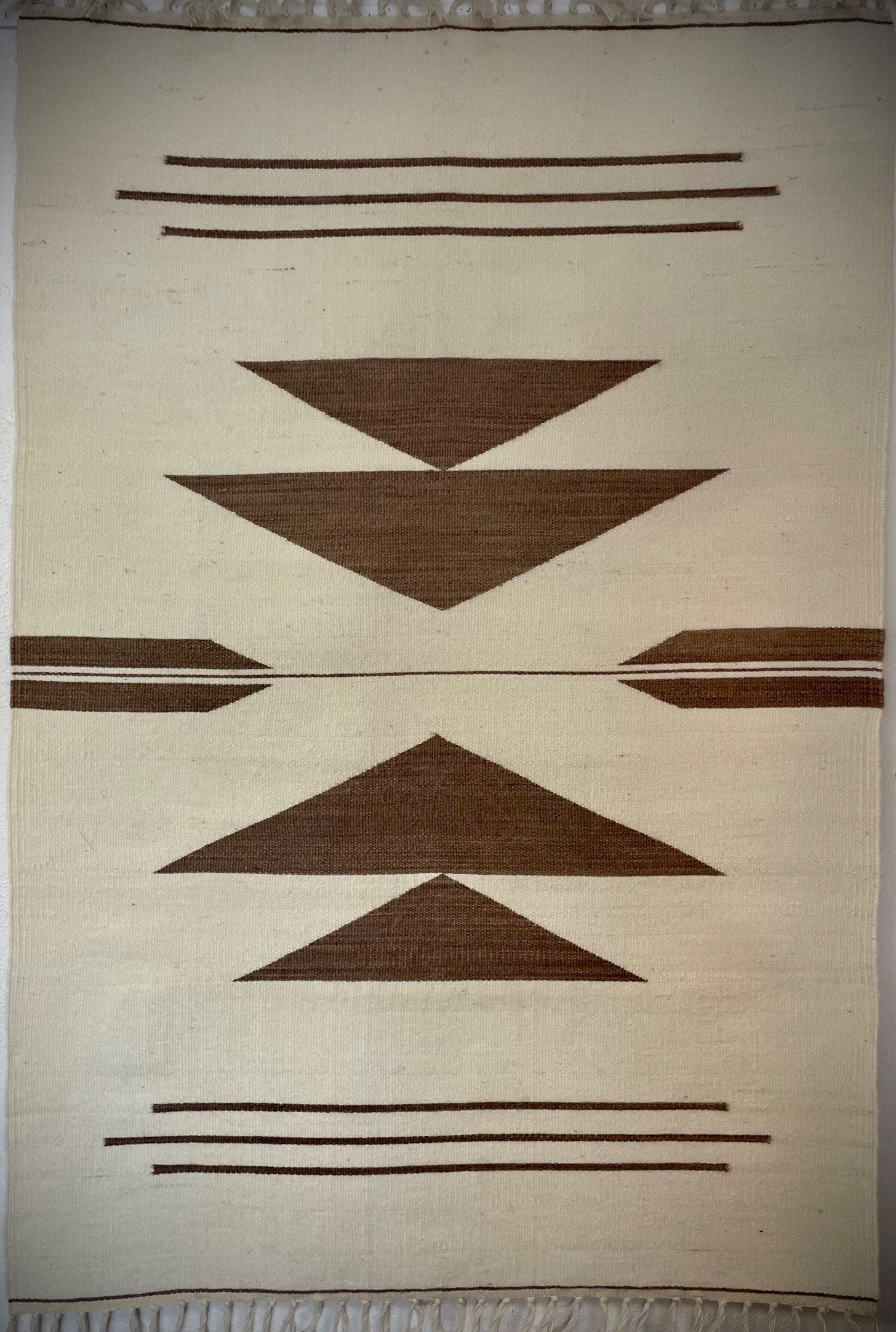
One place where you won’t find a neutral is on the color wheel – no “beige” in sight there. The colors on a color wheel are what we call “hues” – major color families like reds, greens, or blues. Black, white, brown, and grey are true or “pure” neutrals and have no hue undertone from the color wheel at all – they’re literally just “neutral.” Near neutrals like tan and ivory, by contrast, are formed by mixing a little bit of a hue from the color wheel with a pure neutral. For example, tan is a combination of brown (pure neutral) and yellow (color wheel hue).
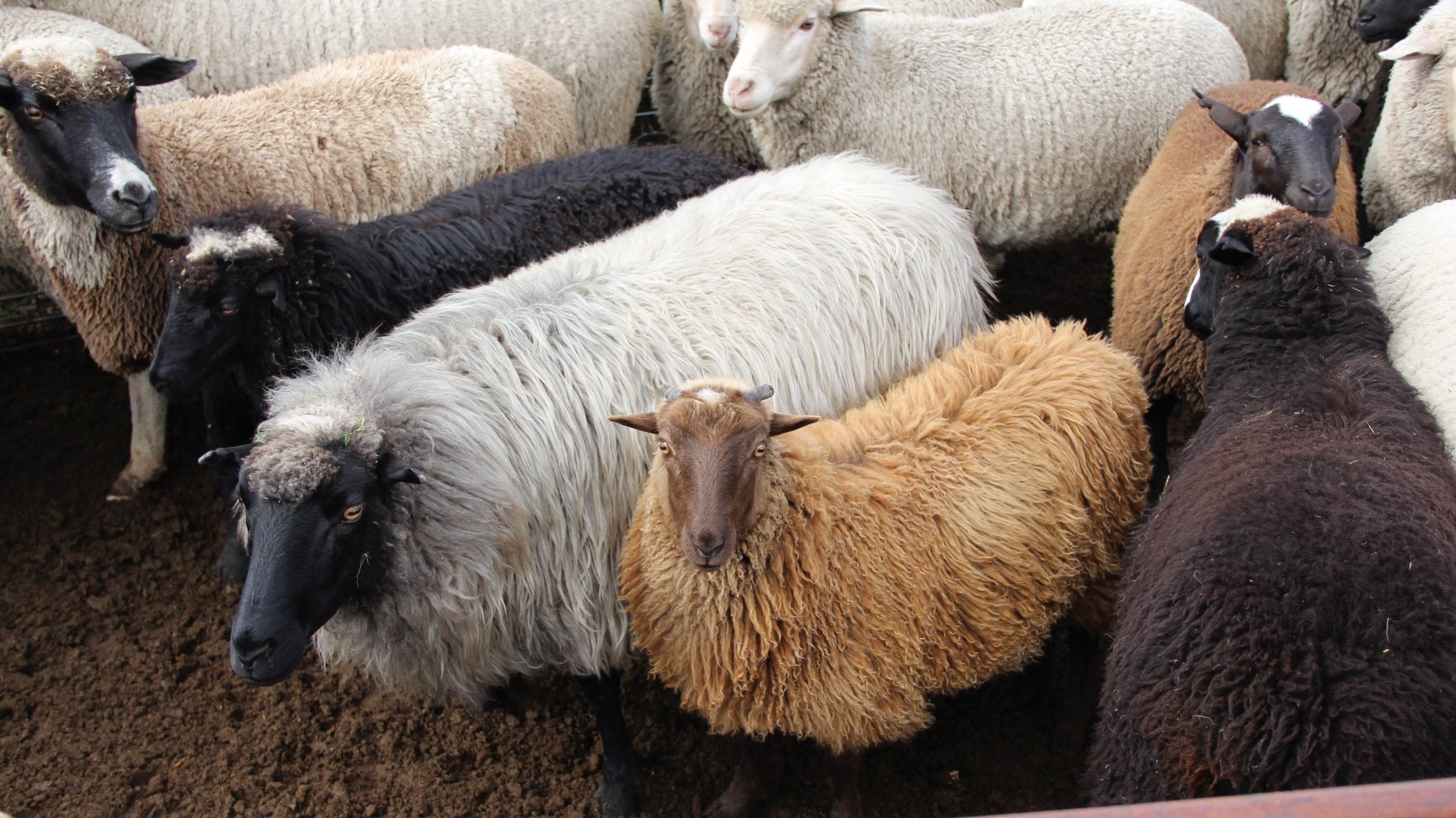
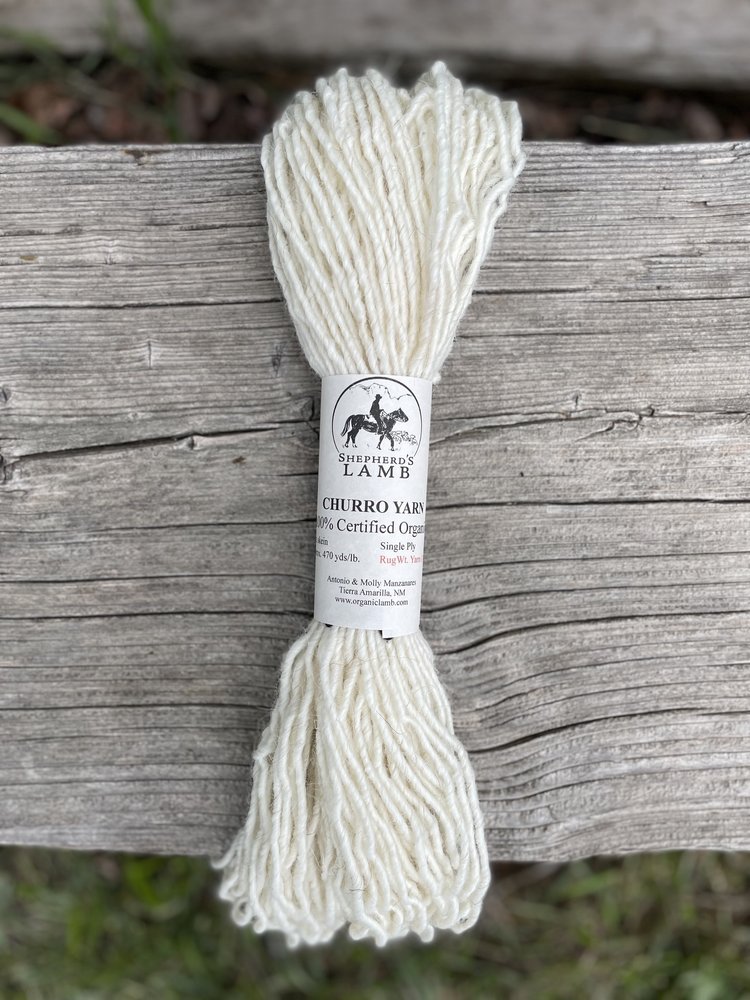
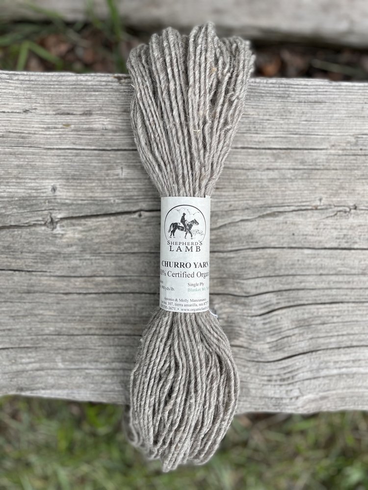
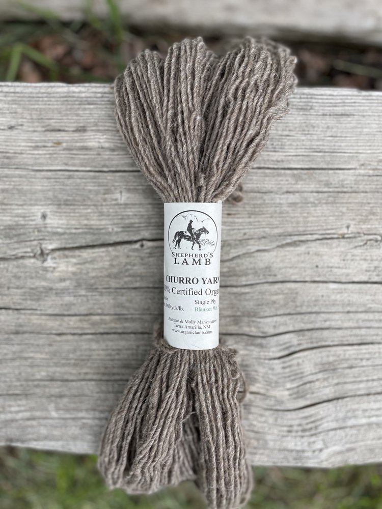
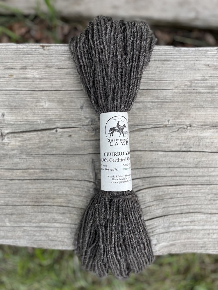
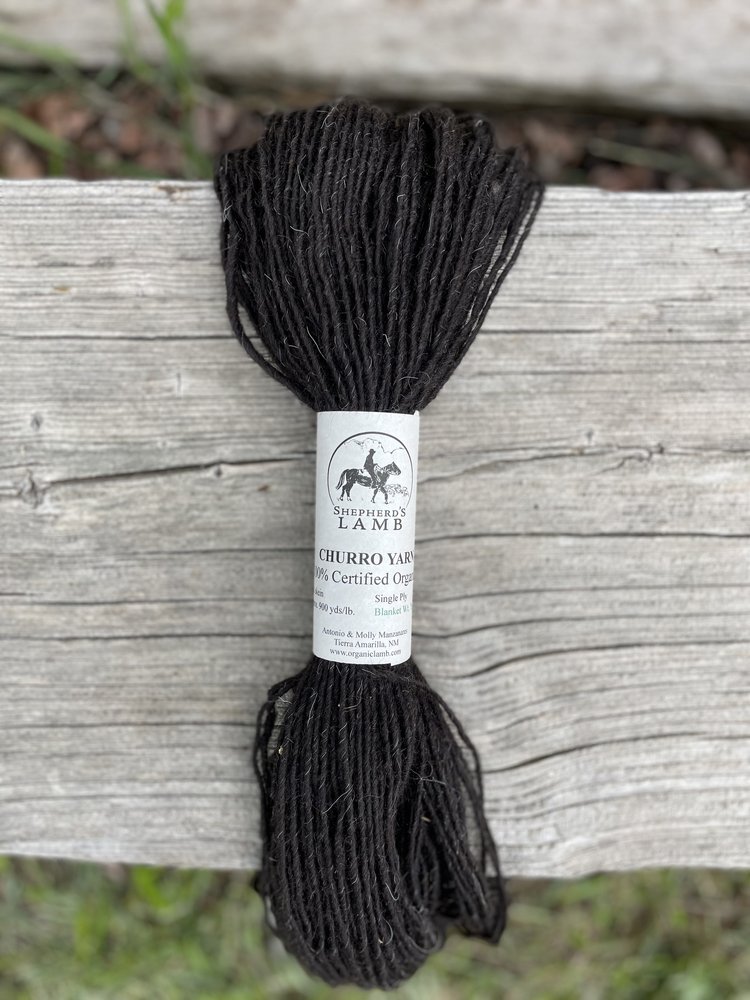
Neutrals are natural colors – colors that naturally occur in our environment – and here at Tierra Wools, our wide variety of neutrals come directly from our sheep! Unlike other breeds such as Rambouillet or Merino which sport an all-white coat, the Navajo-Churro sheep we raise vary widely in fleece color, from black to white and all combinations of gray and brown in between. Their fleeces, spun alone or in combination with each other, make up our undyed natural color yarns collection. Thanks to our multi-colored Churro sheep, we’re able to offer a range of neutrals that include a creamy white, light gray, dark gray, brown, and even natural black – a rarity among naturally-colored yarns.
Using Neutrals in Weaving Design

When planning a weaving design, neutrals can be used alone or in combination with other color wheel hues to create different effects. An all-neutral weaving effortlessly creates a cohesive look with a soothing yet earthy effect. Since they reflect natural colors found in nature, they’re also great for use in pictorial landscape weavings.

Neutrals also pair well with hues from the color wheel. When used in combination colors, especially bright, vivid hues, neutral shades help bring balance to the weaving composition by providing a visually restful contrast to the drama of the other colors in the weaving. They can serve as a contrasting backdrop to other colors and can enhance the appearance of those colors, making them appear more vibrant in the finished weaving.

Both in combination with each other and as a complement to other colors, neutrals are an essential component of weaving design and hold a prominent place in our yarn stash.
And whether you’re a neutral-nut or a former neutral-naysayer, we hope that this brief dive into neutrals helps build your color confidence when designing your next weaving! For more information about choosing colors, read our other blogs on color, Color Sense I: Color Combos and Color Sense II: Hues, Tints, and Tones, Oh My!, where we discuss other helpful color information for creating engaging and beautiful color schemes for you next weaving project.